Choose one next move
Do not try to implement the whole article at once. Choose one message, one offer, or one launch moment.
Recover abandoned carts and collect signups starting at $0.
Recover abandoned carts and collect signups starting at $0.
Knowledge
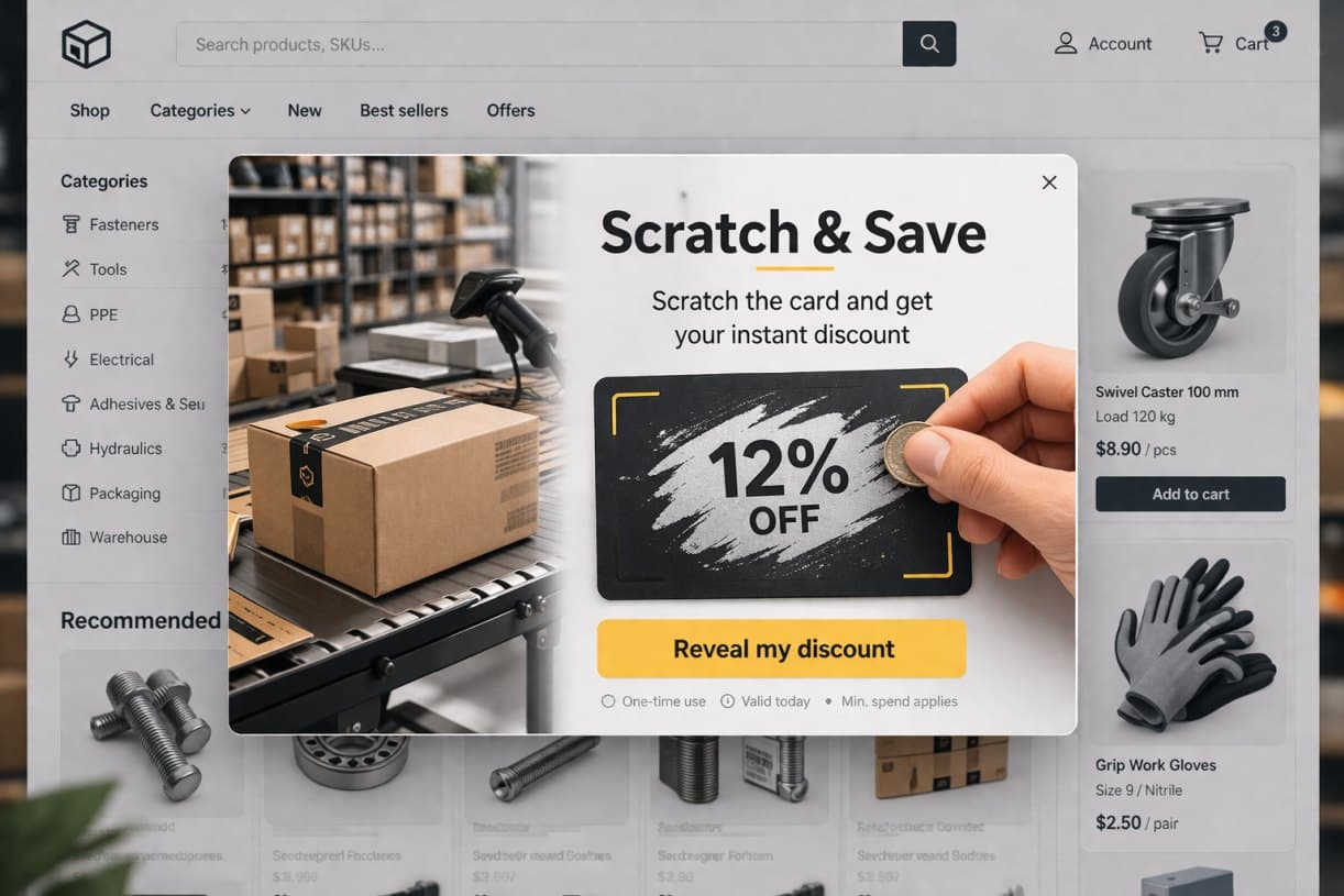
Scratch cards boost sales faster than fortune wheels.
How to use this
Do not try to implement the whole article at once. Choose one message, one offer, or one launch moment.
Translate the takeaway into the first campaign you can validate quickly on your own traffic.
Add more variants, channels, and integrations only after the first campaign already shows business value.
Article
Most online stores greet their potential customers with a classic wheel of fortune. E-commerce owners implement this solution assuming that since the competition does it, it must work and it is the market standard. Analytical practice shows, however, that the results of such campaigns are not always optimal. Consumers are becoming immune to repetitive, schematic mechanics that simply start to bore them. The modern user expects speed, simplicity and respect for their time. In e-commerce, conversion increasingly depends on flawless, smooth microinteractions.
This is where a significant difference between the most popular tools becomes visible. The wheel of fortune certainly attracts attention. However, scratch cards far more frequently and effectively turn that attention into real sales.
Both scratch cards and the wheel of fortune belong to the most eagerly implemented forms of gamification in online stores. What differentiates them is the method of interaction, the duration of the process and the psychological reception by the user.
Marketing scratch cards are the digital equivalent of classic lotteries, working excellently as an alternative to the traditional popup. The user, using a mouse cursor or finger on a smartphone screen, virtually scratches off a protective layer to reveal a hidden reward. Most often this is a discount code or free delivery. This process is characterised by an extremely fast interaction and gives the user a sense of personally discovering benefits without unnecessary delay.
The wheel of fortune is a mechanic based on clear randomness. The user enters their email address and triggers a button that sets the wheel spinning. In this case the mechanism relies on an elaborate animation and waiting for the final result. The customer has no influence over the process after it has been launched, which makes the interaction noticeably more passive compared to the virtual scratch card.
Despite fundamental differences in mechanics and user experience, both formats have exactly the same business goal. From a marketing automation perspective, they focus on maximising conversion, effectively collecting leads to the mailing database and immediately capturing user attention, which forms the foundation of strategies for recovering abandoned carts.
Implementing mechanics known from games into the purchasing process is not merely visual embellishment. It brings measurable business results because it draws on powerful mechanisms of human psychology and behaviourism.
Introducing a game element automatically activates the reward centre in the user’s brain. The awareness of the possibility of winning a discount triggers a release of dopamine, which positively disposes the potential customer towards the brand. The excitement built in this way dramatically facilitates the decision to share contact details in exchange for a specific benefit.
A large proportion of users browse online stores in an almost automated way, passively scrolling through consecutive pages on their smartphone screen. Gamification effectively interrupts this pattern by requiring a specific, non-routine action. Moving from passive scrolling to active interaction pulls the consumer out of their lethargy and decisively increases their focus on the store’s offer.
Curiosity is one of the strongest motivating factors for action in marketing. The unknown hidden beneath the virtual scratch layer builds tension and a natural desire to quickly discover the result. Users subconsciously strive to satisfy their curiosity and close the information gap, which directly translates into a dramatic increase in click-through rate and engagement with the widget.
According to the psychological principle of commitment and consistency, persuading a user to perform the first seemingly trivial action significantly increases the chance of them taking the next, far more important one from a business perspective. The moment a customer actively interacts with a scratch card represents visible micro-engagement. A user who has invested time and a physical action in discovering a discount code subconsciously assigns it a higher value. As a result, they are much more willing to complete the transaction so that the reward they earned does not go to waste.
Understanding why one format generates better sales results than the other requires looking at them through the lens of analytics and usability. The comparison below precisely identifies the differences between both solutions in the e-commerce context.
| Element | Scratch cards | Wheel of fortune |
|---|---|---|
| Interaction | active | passive |
| Time | immediate | delayed |
| Mobile UX | very good | average |
| Psychology | curiosity | randomness |
| Conversion | often higher | context-dependent |
The decision to implement a specific tool should be based on solid arguments. There are five main reasons why virtual scratch cards more effectively achieve sales goals.
The modern e-consumer is impatient. Scratch cards eliminate the irritating waiting time for a result. The absence of a prolonged animation means the user immediately receives a stimulus in the form of a discount code, which dramatically shortens the path to making a quick purchasing decision and heading to checkout.
The wheel of fortune mechanic is based on an algorithm over which the customer has no power. With a scratch card, the user physically “reveals” the reward through finger or cursor movement. This gives them a clear sense of control and agency, which in sales psychology translates into a higher sense of ownership of the earned discount.
The vast majority of traffic in online stores today comes from smartphones. The gesture of “scratching” a screen is completely natural and intuitive for mobile device users. Moreover, scratch cards load instantly and do not require generating heavy animations that burden the browser, which in the case of the wheel of fortune can cause errors on weaker devices.
The phenomenon of so-called banner blindness also applies to popups. The wheel of fortune has become so widespread that many users close it reflexively before even reading the offer. Scratch cards are still a less obvious and less overused format in Polish e-commerce, which allows them to effectively cut through the information noise.
The question “what is hiding underneath?” works on the imagination far more powerfully than observing values already visible on the wheel’s face. The mechanism of gradually revealing the reward builds micro-tension that directly translates into higher engagement and a desire to finalise the order using the earned benefit.
As a conversion optimisation expert I must state clearly: the wheel of fortune is not a bad tool by definition. There are specific business scenarios in which this mechanic can deliver satisfying results.
If your primary goal is to generate buzz on social media and reach as wide an audience as possible, a spectacular wheel of fortune with a very attractive but rare main prize can act like a magnet for reach.
During events such as Black Friday or Cyber Monday, when users are focused on aggressively hunting for deals and strong impressions, the element of casino-style randomness and excitement can resonate well with the general atmosphere of the shopping celebration.
Generation Z and younger consumers are strongly accustomed to highly stimulating, dynamic interfaces known from mobile games and TikTok. In their case, a spinning wheel and the associated dopamine release may be met with positive reception.
To summarise this point: the wheel of fortune has not become obsolete. It simply is not always the most effective and predictable solution in the context of everyday, systematic work on improving the conversion rate and building a smooth user experience.
The effectiveness of marketing tools depends largely on precisely matching them to the right stage of the user journey. From an e-commerce analytics perspective, virtual scratch cards show the highest effectiveness at specific moments where speed of interaction and the psychological element of reward discovery play a decisive role.
Systematically building an email database is the absolute foundation of effective marketing automation. Scratch cards work brilliantly as the engine of lead generation campaigns because they completely change the dynamics of data acquisition. They offer a fair, gamified exchange of value. A user intrigued by what lies beneath the virtual layer shows significantly less resistance to leaving their email address than when confronted with a static, traditional newsletter signup form.
Exit intent technology, capturing movement at the moment of attempted departure from the store, requires the application of an immediate and distinctive stimulus. When a customer moves their cursor outside the page area, there is no room to engage them with slow, multi-second animations. A scratch card acts here as an instant behavioural interruption. The need to perform a simple action to discover a rescue discount strongly engages attention and dramatically increases the chances of blocking the exit and saving a potentially abandoned cart.
Persuading a completely new visitor to complete their first transaction is the most expensive element of the entire sales funnel. A marketing scratch card is the ideal tool for breaking down the initial purchasing barrier. A discount on first purchases that the customer must actively earn through a scratching gesture holds significantly higher value in their subconscious than a publicly available code pasted on the store’s main banner. This mechanism builds in the user a sense of possessing an earned reward, which constitutes a powerful motivator for heading to checkout.
In an environment where the vast majority of traffic and conversions is generated by smartphones, the scratch card mechanic outclasses most alternative popup formats. The key here is excellent adaptation to touch interfaces. The gesture of rubbing the screen with a finger is completely natural for smartphone users. Additionally, the lightweight code and the absence of complex animations to render means scratch cards work smoothly and flawlessly on every device. This guarantees a perfect mobile UX, eliminating technical obstacles that often torpedo conversion on small screens.
Simply implementing a virtual scratch card does not guarantee an immediate increase in sales. For this mechanic to genuinely improve conversion rates, it must be designed in accordance with Conversion Rate Optimisation (CRO) best practices. The checklist below provides a ready foundation for building a highly effective widget.
The message about the potential prize must be absolutely unambiguous and easy for the user to process in a fraction of a second. Complicated promotional conditions such as multi-level discounts dependent on cart contents should be avoided. Information about the possibility of winning free delivery or a specific discount amount on the first order works most effectively. Clarity of the offer directly reduces cognitive friction and accelerates the decision to interact.
The entire reward discovery process should require minimal effort from the visitor. The interface must respond smoothly to every finger movement on the smartphone screen, even imprecise ones. From a usability perspective, the scratch card script should automatically reveal the entire reward after approximately 30 to 40 percent of the virtual protective layer has been scratched away. Forcing the customer to perfectly scratch every pixel causes frustration and leads to abandonment of the action.
An important optimisation element is what happens immediately after the discount code is revealed. The transition from winning to completing the order must be seamless. The best e-commerce practice is to automatically apply the earned discount to the user’s cart. If the technology does not allow for this, the code should be extremely easy to copy with a single click. Requiring the user to manually type a string of characters is a guaranteed drop in conversion.
The Call to Action button appearing after the reward is revealed represents the final impulse to complete the purchase. Instead of passive messages such as Close or OK, active benefit-oriented verbs should be used. Using phrases such as Claim your discount and go to checkout or Use your discount now effectively directs the customer’s attention to the next step in the sales funnel.
Displaying a scratch card at zero seconds, immediately after the page loads, is one of the most serious mistakes in e-commerce. The user has not yet had a chance to browse the offer and is already being hit with a popup. Optimal timing is based on engagement analysis. The widget should activate after a certain percentage of the page has been scrolled, after a certain number of seconds have been spent on it, or only at the moment exit intent occurs.
Even the most innovative marketing formats lose their effectiveness if they are implemented contrary to the basic principles of user experience design. Avoiding the mistakes below is a necessary condition for gamification to generate profits rather than reputational damage.
Bombarding a customer with the same popup every time they refresh a subpage is the fastest route to causing irritation and permanent departure from the website. It is essential to apply capping rules, meaning limiting the number of displays per unique user within a defined period. If a customer has once closed a scratch card or wheel of fortune, the mechanism should remember this choice and not disrupt their further browsing of the product range.
The foundation of successful gamification is a fair exchange. The user pays with their time, attention and email address. In return they expect an adequate reward. Offering symbolic discounts of two percent or free PDF materials of low educational value within a scratch card will not compensate for the effort of leaving personal data. The reward must constitute a real, tangible financial lever for the buyer.
Too many garish colours, illegible typography or poorly formatted graphics can destroy the potential of any campaign. The navigation aspect is particularly critical here. The closing button (X) must be easy to find and click, especially on mobile devices. Hiding it or reducing its size is a tactic bordering on Dark Patterns, which in the long run always damages the bounce rate.
Implementing gamification mechanics based solely on intuition is a fundamental mistake in e-commerce management. Online stores differ dramatically from one another in terms of their target audience characteristics and the specifics of the products they sell. What generates double-digit conversion in the fashion industry may turn out to be a complete failure in a B2B electronics store. The absence of analytics and blind reliance on default widget settings makes any rational cost-per-acquisition optimisation impossible.
In the world of e-commerce, basing business decisions on intuition is the fastest route to burning through the marketing budget. The only objective way to verify whether a scratch card or wheel of fortune will work better in your store is to conduct reliable A/B tests.
The fundamental mistake in popup analytics is focusing on a single metric. To assess the genuine effectiveness of gamification, three indicators need to be examined. First, CTR (Click-Through Rate), which will show what percentage of visitors actually interacted with the widget. Second, conversion, meaning the proportion of users who ultimately completed an order using the earned discount code. Third, lead quality. You need to check whether the email addresses acquired in this way generate value in subsequent email campaigns, or whether they are merely one-time bargain hunters who show no further engagement.
A reliable A/B test requires achieving adequate statistical significance. Evaluating the effectiveness of popups after two or three days is pointless because consumer behaviour differs dramatically depending on the day of the week or time of the month. The golden rule in conversion optimisation (CRO) is to run the test for a minimum of two complete sales cycles. For most online stores this means a period of two to four weeks, provided a sufficiently large volume of site traffic is guaranteed.
Interpreting data must always be based on the ultimate business impact. It sometimes happens that the wheel of fortune generates a higher CTR due to its flashy and intrusive animation, but it is the users engaging with scratch cards who show higher purchase conversion at the very bottom of the funnel. The winning format is always the one that delivers a higher return on investment (ROI) and generates real sales, not the one that collected the most empty, non-converting clicks.
Academic discussions about whether scratch cards have an absolute advantage over the wheel of fortune lose their relevance when confronted with operational reality. The ultimate success lies not in the mechanic itself, but in operational agility and the way the process is managed.
A significant proportion of e-commerce businesses fall into the trap of technological stagnation. The main barrier is a complete absence of testing of implemented creatives. A popup launched once stays on the site for months, becoming completely invisible to regular customers. This situation results from a lack of software flexibility and a close dependency on external developers. A situation in which changing the terms of a promotion or swapping the graphic on a scratch card requires opening a ticket with the IT department freezes optimisation and generates unnecessary costs.
Real, step-change improvements in CRO metrics are achieved by organisations that prioritise speed of implementation and continuous variant testing. Conversion is driven by precise alignment of the message with the user’s context. The store that wins is the one capable of fluidly juggling display scenarios, testing different activation moments such as exit intent versus time on site, and immediately responding to collected consumer behaviour data.
In practice the greatest market advantage is gained by stores that not only implement modern popups but possess the infrastructure for testing them rapidly. For this reason, dedicated tools such as DropUI are increasingly being used in optimisation strategies. Solutions of this type allow engaging mechanics such as scratch cards and the wheel of fortune to be implemented within just a few minutes, testing in a live environment what genuinely works for the audience, entirely without interfering with the source code of the platform.
Using modern tools unlocks the potential of the marketing department. Fast tests and hypothesis validation simply mean fast financial results. The absence of any need to engage the IT team is a powerful injection of flexibility. It allows aggressive optimisation of the purchasing path in real time, which forms the foundation of effective sales scaling in e-commerce.
Implementing effective gamification in an online store is not about blindly following market trends. The advantage of virtual scratch cards over the classic wheel of fortune is not based on their being a fashionable solution right now. Their strength lies in psychology and usability. Scratch cards work noticeably better because they are faster, far simpler to use and more precisely aligned with the natural way in which the modern consumer makes instant decisions.
Analysing user behaviour in e-commerce, four firm business conclusions can be drawn. Above all, scratch cards offer immediate and highly intuitive interaction, which is critical for mobile traffic. From a psychological standpoint, e-consumers clearly prefer to actively discover their assigned reward rather than passively wait for a lottery animation to finish. In purchasing path design, simplicity and friction reduction always beat excess of form over substance and exaggerated visual effect. Furthermore, continuous variant testing and operational flexibility are of far greater importance for scaling sales than the initial choice of tool.
Ultimately in e-commerce analytics, what counts is closing the sale. The best popup is not the one that looks the most impressive and has the most expensive graphic design. The best popup is the one with which the user enters into smooth interaction, and after which they simply make a purchase.
FAQ
Scratch cards in e-commerce are interactive widgets that allow users to reveal hidden rewards by swiping on the screen. This mechanic mimics real-world scratch tickets, offering discounts, free shipping, or bonuses. The interaction increases engagement and speeds up the decision-making process, leading to higher conversion rates.
Scratch cards provide immediate gratification and eliminate waiting time associated with spinning animations. Users interact instantly and reveal their reward within seconds, which aligns with modern attention spans. This faster feedback loop increases emotional satisfaction and improves the likelihood of redemption and purchase.
The wheel of fortune can still be effective in campaigns focused on entertainment, seasonal promotions, or younger audiences. However, due to overuse and banner blindness, its performance in daily conversion optimization is often lower compared to faster and more direct formats like scratch cards.
Gamification activates psychological triggers such as dopamine release, curiosity, and reward anticipation. These mechanisms turn passive browsing into active engagement. As a result, users feel more invested in the process, which increases their likelihood of completing purchases and interacting with the brand.
Scratch cards are highly intuitive on mobile because they rely on natural gestures like swiping. They load quickly, require minimal interaction effort, and perform well even on slower devices. This makes them ideal for mobile-first e-commerce environments where speed and simplicity are critical.
The optimal moment is after the user shows engagement, such as scrolling the page, spending time on a product, or attempting to leave the site. Triggering the popup too early can interrupt the experience and reduce effectiveness, while proper timing maximizes conversions.
Simple and clear rewards perform best, including percentage discounts, fixed-value coupons, or free shipping. These offers are easy to understand and immediately valuable. Complex conditions or unclear benefits reduce trust and decrease engagement and conversion rates.
Yes, scratch cards significantly increase email collection rates by offering an engaging exchange. Users are more willing to share their email when they receive an immediate reward, often resulting in higher opt-in rates compared to static forms or traditional popups.
Scratch cards can be triggered at exit intent, offering users a last-minute incentive like a discount or free shipping. This unexpected reward re-engages users and often convinces them to complete the purchase instead of abandoning their cart.
Common mistakes include showing popups too frequently, offering low-value rewards, using slow-loading designs, and skipping A/B testing. These issues frustrate users and reduce trust, ultimately lowering conversion rates and campaign performance.
Scratch cards often outperform traditional popups because they require active participation. Instead of passively reading a message, users engage with the interface, which increases attention, emotional involvement, and overall conversion effectiveness.
Effectiveness should be measured using metrics such as click-through rate, conversion rate, and lead quality. It is important to track whether users who interact with the scratch card actually complete purchases, not just whether they click on it.
An A/B test should typically run between two and four weeks to gather reliable data. This duration accounts for different user behaviors, traffic variations, and purchasing patterns, ensuring statistically significant and actionable results.
Yes, many users experience fatigue from overused formats like spin wheels. Repetition leads to banner blindness, reducing engagement. Newer formats such as scratch cards feel fresher and more interactive, making them more effective in capturing attention.
When users actively reveal a reward, they feel a sense of control and ownership. This psychological effect increases perceived value and emotional attachment to the reward, making users more motivated to redeem it and complete the purchase process.
Ready to launch
Create an account and test the first campaign on your own traffic. Less reading for later, more ideas you can validate in action right away.
Getting started takes a few minutes